We all know how the saying goes: less is more. This certainly applies to the world of graphic design.
As a designer, your job is to create visually stunning materials that have the power to influence people either on a personal or a consumer level and minimalistic designs are perfect for that.
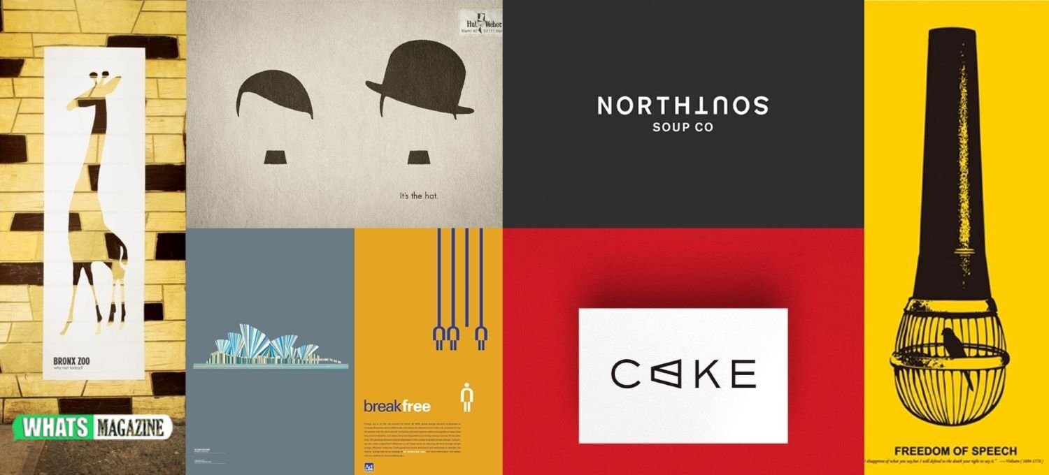
First introduced in the 1960s as a rejection of the subjective work of abstract expressionism, minimalism centres around the artist or designer homing in on the essentials of any project and removing any unnecessary features. This helps to get the message of the piece across faster without causing much stress on the viewer’s eye.
We’re here to talk you through the best ways you can bring minimalism to your work. So if you’re creating designs for signage, posters or websites, you’ll want to read on for our top tips.
In this article
Powerful minimalistic styles
White space
Embrace the emptiness of a blank canvas to give your work the space it needs to breathe. The white background behind your design allows the observer’s eye to be drawn straight to the important design elements on the page, which makes it highly effective.
There’s no need to fill every gap on a page to get your message across, focus on the basics and your design will reap the rewards.
Coloured backgrounds
Similar to the style of the white background, we love the idea of using one colour as your background to expand the tonal palette in your work. Give different colour combinations a go and you’ll find that the background doesn’t always have to be white to stand out.
This can be a great choice for creating a poster that stands out as people pass it and any colour can be minimal when used in the right way.
Photography/illustration
Use fewer words and use more photography or illustration in your designs – a picture is worth a thousand words, after all. Text can look cluttered very easily if you use too much of it. Try using a beautiful image that fits the brand and then only include the necessary information in the design.
The image will be useful to draw in the onlooker – they then have all the information needed to understand what the piece is about without having to think too much.
Typography
Once you have drawn people in with your fascinating visuals, you’ll want to make sure you are using a font that is readable. Choose one of the most popular fonts that are also easy to read. The last thing you want is to use a funky font that may look cool but, in reality, is completely unreadable.
The prominence of minimalism in design would not have been possible without the likes of Donald Judd, Carl Andre, Kenneth Noland and many more incredible artists. Continue their legacy in your work and you’ll see just how successful your minimalistic pieces can be.