But doing so is easier said than done. You must also compete with countless other companies looking for the same opportunities.
If you want to get the most from your online store, you must do everything possible to optimize it. Follow the advice in the guide below to improve your store’s profitability.
In this article
Invest in SEO
One of the critical parts of growth with an online store is to reduce your customer acquisition cost. Doing this isn’t easy to do when you utilize paid ads. There is a lot of competition for ad space, and the chances are good that your costs will go up over time.
Finding organic searches of traffic will solve that problem — and SEO is one of the best ways to do this.
Research the terms people use to look for information about your products. Once you have those search terms, invest in creating content that fulfills the search intent of Google searchers.
If you do a great job, you have a better chance of ranking on Google and getting free website traffic.
Improve the User Experience
You may have a great selection of products, but customers still need an easy way to buy what you have. If you don’t have a great user experience, people will head to another store and purchase something there.
The first thing to check is your mobile-friendliness. Many people use mobile devices exclusively to browse the internet today. If you don’t have a responsive web design, you won’t be able to serve those customers properly.
The same is true for your website speed. People expect webpages to load in a few seconds. Without a speedy website, you risk people getting impatient and heading elsewhere to find products.
You may need to work with a professional for this task, so don’t hesitate to find help from an experienced web designer.
Offer Enough Support
Many customers will still have questions before buying products. The information you include on your product pages won’t be enough to inform customers about everything.
In cases like this, they want support. Customers want to be able to reach out to a company to get answers quickly.
Provide this ability to your customers. Adding a live support option is one of the best ways to do this. Customers will see a chat window on the bottom of their screen and can talk to a customer support representative using the box.
If you can’t offer live support, make finding your contact information easy. Just make sure you offer a quick turnaround time to questions to stop people from looking for help elsewhere.
Personalize the Experience
Personalized shopping experiences are necessary today. Since Amazon now offers so much personalization in their store, customers now expect it everywhere else on the internet.
The good news is that you can also do this. Once you have enough customer and shopping data, you can start offering more relevant recommendations to your customers.
Start on the product pages. Recommend similar products that other customers purchased along with what the customer is looking at. Once someone is a customer, you can offer email recommendations based on your collected data.
You may have other options based on your online store platform, so see what products are available for personalizing the eCommerce experience.
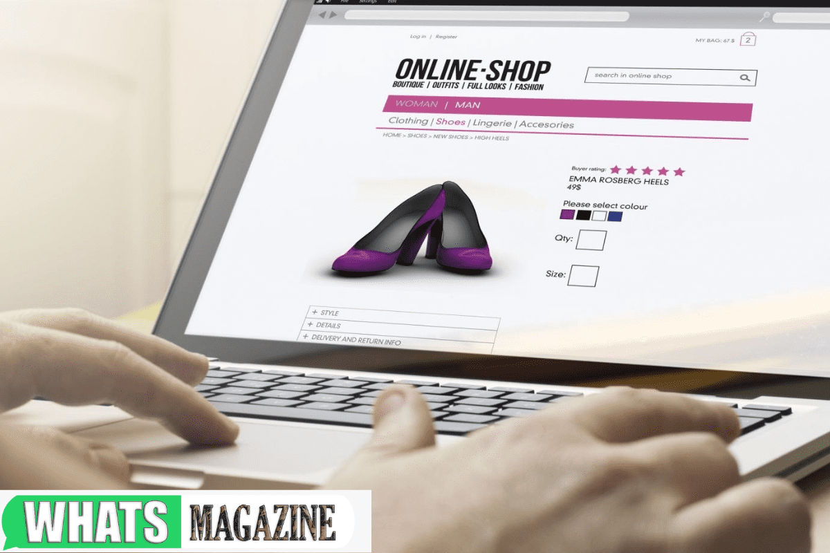
Take Great Product Photography
Shoppers are taking a chance when they shop online. They don’t get to see what they buy in person, so they trust the online store to be truthful about what they offer.
This means you’ll need to build trust with shoppers interested in buying. And the best way to do this is to try and show them exactly what they will receive when buying.
You do this by taking great product photos. Show what you offer from every angle possible to help the consumer understand everything about your offering. There is a skill to doing this, so consider hiring a commercial product photographer.
Demonstrate Security
There is a lot of cybercrime and fraud on the internet. Criminals pretend to be reputable people and companies and trick people into providing sensitive financial information. Some online stores also don’t take security seriously and get hacked.
You need to show that your company takes security seriously. You can demonstrate this on your e-commerce page and the rest of your website.
Set up SSL on your website to make sure you get the lock in the browser bar. You can also put trust seals in your website footer that demonstrate your website’s protocols to stay secure. You can reach out to your security provider to get these things.
Highlight Deals
You’ll probably run a lot of deals to attract new customers for your business. Even if you sacrifice short-term profits, you’ll get customers exposed to your brand and fans of your business.
But people won’t know about those deals unless you tell them. Don’t let people browse your store and only see discounts when on the product page.
Highlight discounts wherever you can. This means adding it to your homepage, including banners, and sending emails.
Keep Working on Your Online Store
It’s not easy to succeed with an online store. You no longer need a technical background to set up shop and start selling. Because of that, countless online stores are available for every product you can imagine.
That means you must do whatever possible to optimize your website to sell products. The advice above is a great place to start that process, so put the information into place today.
Are you interested in more business tips to help you grow your business? Check out more website articles to learn more business growth tips.